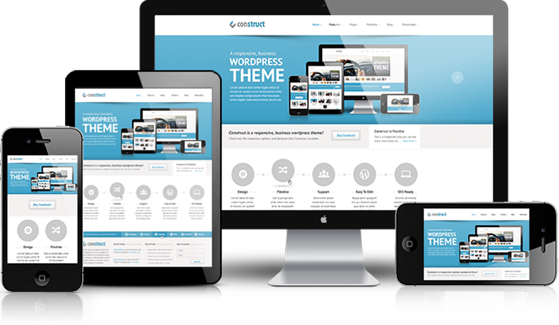
Receptive web design has become more significant as the quantity of mobile traffic now estimates for more than half of total internet business. We establish long-term relations between our customers and brands through social communications.

RESPONSIVE WEBSITE

Responsive website design allows designers to design and publish the same content everywhere, whether it is your computer screen or mobile device. The design is an approach of web page production that makes flexible designs, flexible forms and style sheet media inquiries. It is a development viewpoint of rendering a website page in a valid and easy-to-read format across a variety of methods and web browsers on different gadgets.
HOW WE DESIGN A RESPONSIVE WEBSITE
Responsive sites provide you with a higher level of user satisfaction and also to improve the site’s SEO. When it comes to responsive website development, we have three layouts to choose from:

ADAPTIVE LAYOUT
Adaptive design leads to the graphical user interface (GUI) design which leads to different screen sizes. Designers implement it in GUIs, such as webpage’s, which must function on different gadgets of various sizes. (e.g., a Smartphone’s, tablets).

FLUID-ADAPTIVE DESIGN
Sometimes we need to mix the adaptive and fluid techniques commonly talking; the concept behind a fluid-responsive layout is that it practices fixed widths in pixels to defined breakpoints and relative fluid units (for instance percents) between these breakpoints.

FLUID LAYOUT
It covers the whole width of a browser. Usually, it is more time consuming for both web developers and web designers. It is very complicated for the designers to determine whether the elements should expend or align in any direction. This is achieved by defining the areas of the surface by using percentages instead of established pixel diameters. Most webpage developers include one, two, or three columns.
